How to Display Art in Your House: Expert Tips for Stylish and Inviting Home Spaces
Art has the power to transform any space and make it feel truly personal. I love how a well-placed painting or photograph can spark conversation and set the mood for an entire room. Whether I’m working with bold canvases or delicate prints I know the right display can turn even the simplest piece into a stunning focal point.
Figuring out how to showcase art at home isn’t just about hanging something on the wall. It’s about finding harmony with your space and letting your personality shine through every choice. I’ve learned that with a few thoughtful decisions anyone can create a home that feels curated and inviting.
Why Displaying Art at Home Matters
Displaying art at home strengthens personal identity in each space. Each artwork, such as oil paintings, photography, or sculptures, reflects tastes, values, and individual stories. I use these pieces to create a unique visual narrative that distinguishes my home from others.
Art in living areas enhances emotional well-being. Studies from the University of London and several wellness journals report that viewing expressive art stimulates positive brain activity, reduces stress, and improves mood. I see increased relaxation in spaces when I add calming landscapes or abstract pieces.
Strategically displayed art increases property value. Interior designers often highlight that homes featuring original or thoughtfully curated art achieve 5%-10% higher sale prices (National Association of Realtors). I use this effect when staging or upgrading my home.
Social engagement and conversation thrive around displayed art. Visitors often ask about the origins or artists behind my pieces, and this interaction deepens social bonds. I notice that eclectic collections, such as mixed-media installations, are most likely to spark discussion.
Art fosters lifelong learning and inspiration. Every time I encounter new or unfamiliar work—like global folk art or modern prints—I engage with new ideas and cultures. This variety keeps my environment dynamic and intellectually enriching.
Common Art Types and Their Impact
| Art Type | Emotional Effect | Space Examples |
|---|---|---|
| Abstract Paintings | Stimulates creativity | Living room, office |
| Landscape Art | Promotes calm | Bedroom, hallway |
| Black-and-White Photos | Encourages reflection | Entryway, dining room |
| Sculptures | Adds sophistication | Foyer, shelves |
Choosing the Right Art for Your Space
Selecting the right art for my house means aligning each piece with both my personal taste and the unique function of each room. When I balance aesthetic choices with spatial intent, I create a cohesive and engaging living environment.
Considering Personal Style and Taste
Reflecting my style forms the foundation for a curated art collection. I identify colors, themes, or artistic movements that resonate with me—abstract patterns, realistic landscapes, or figurative portraits. Consistency ensures harmony across multiple rooms filled with eclectic or minimalist art pieces.
| Style/Theme | Example Elements | Color Palette |
|---|---|---|
| Modern/Abstract | Geometrics, bold color | Primary, neon |
| Classic/Traditional | Portraits, landscapes | Earthy, muted |
| Bohemian | Mixed media, textiles | Jewel tones |
I consider existing decor and let dominant shades or motifs guide art selection for fluid visual transitions.
Matching Art with Room Function
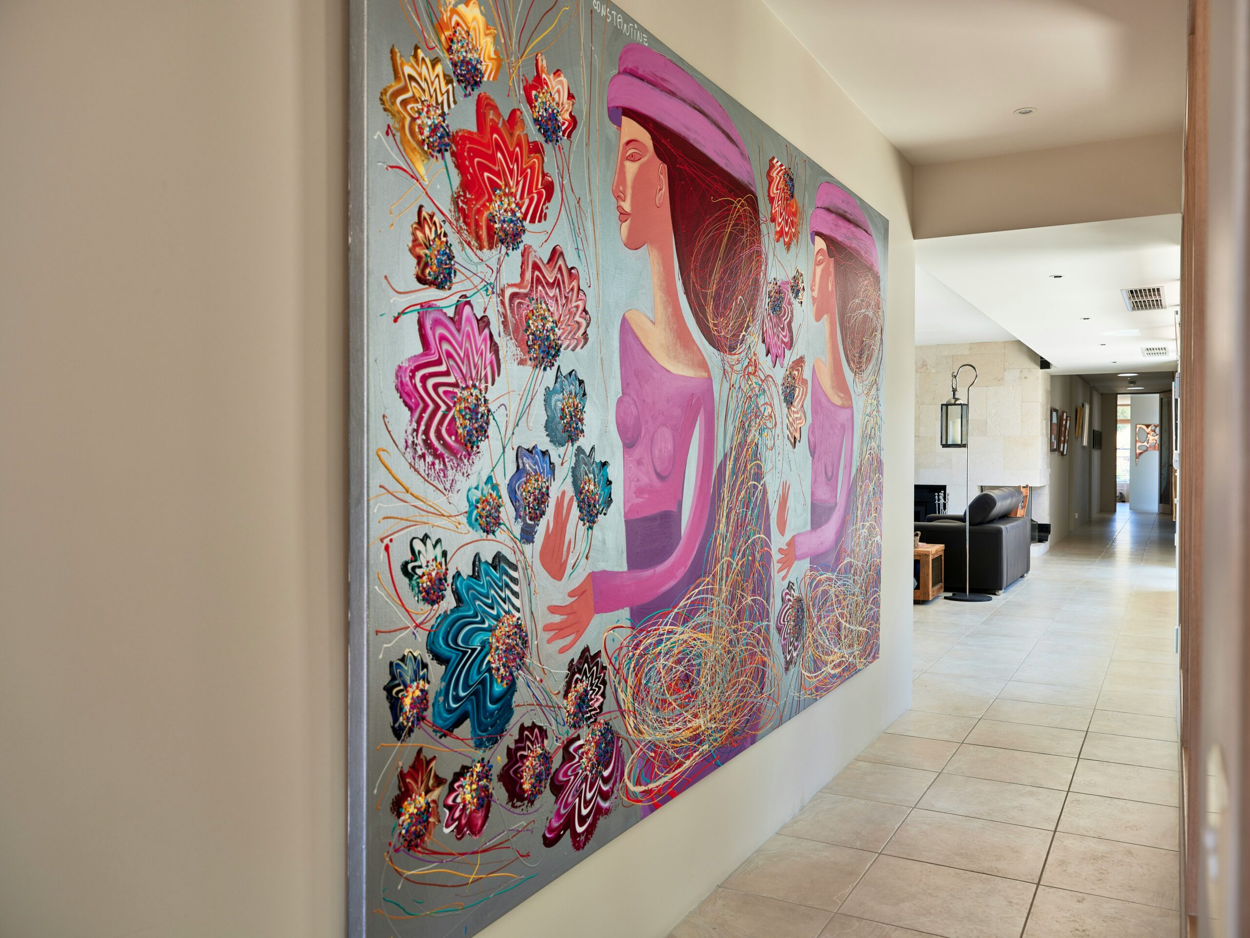
Aligning art with each room’s primary purpose optimizes atmosphere and functionality. In living areas, I display large statement pieces—for example, expressive canvases—for conversation starters. In bedrooms, I favor calming images like nature photography or delicate watercolors for relaxation. Kitchens suit smaller, vibrant works or still lifes that enhance energy without clutter.
| Room | Ideal Art Types | Placement Tips |
|---|---|---|
| Living | Large canvases, bold abstracts | Centered above main furniture |
| Bedroom | Serene landscapes, soft prints | Above bed or across from window |
| Kitchen | Small prints, playful themes | Open shelves or nook walls |
| Hallway | Gallery wall, series of photos | Eye-level symmetry |
If a room changes function or design, I reassess art choices to maintain cohesion and utility. Displaying art aligned with personal style and room purpose elevates every space throughout my home.
Placement Principles for Art Display
Placement principles shape how art interacts with space and people in a home. I focus on clear guidelines that establish unity, balance, and engagement wherever art appears.
Eye Level and Visual Flow
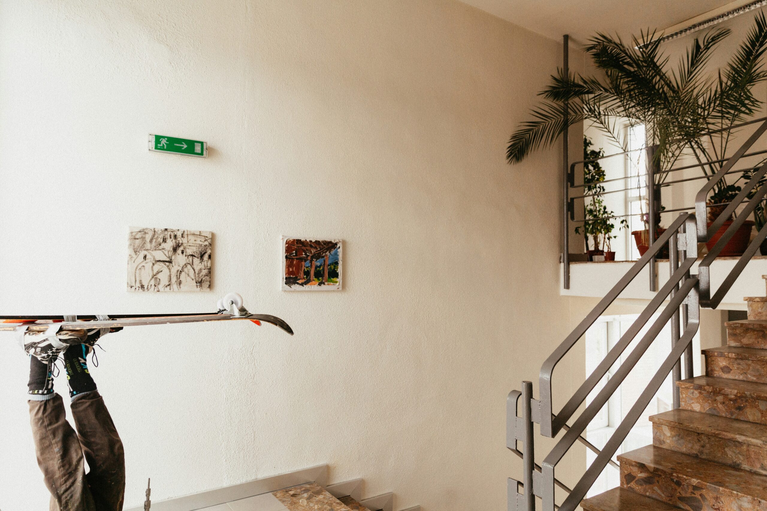
Eye level positioning ensures that artwork stays visible and inviting. I place most pieces so the center sits about 57″–60″ from the floor, matching standard gallery height. This fosters natural sightlines and reduces visual fatigue.
I maintain visual flow by aligning multiple artworks’ centers on a common horizontal line. For large rooms, I elevate or lower art slightly to keep focus aligned with seating arrangements or main architectural features. Consistency in line, height, and spacing guides attention and prevents clutter, especially for series or multiple pieces.
| Placement Criteria | Recommended Height or Range | Common Use |
|---|---|---|
| Standard Eye Level | 57″–60″ from floor to center | Living rooms, hallways |
| Above Furniture | 6″–12″ above backs | Sofas, console tables |
| Staircase Placement | Align with the ascending step | Stairwells |
Grouping and Arranging Artwork
Strategic grouping creates visual impact. I cluster similar frames, themes, or colors for harmony. For gallery walls, I use even spacing, typically 2″–4″ between frames, forming cohesive units. Asymmetrical layouts add energy, while mirrored or grid patterns add structure.
I scale art groups to fit the wall—covering ⅔ to ¾ of the available width above furniture like couches or beds. This anchors the arrangement and enhances proportion. I stagger frame edges if the pieces vary in size, keeping cohesion with a balanced focal point.
| Arrangement Type | Best For | Example |
|---|---|---|
| Grid | Uniform pieces | Series of photographs |
| Salon or Gallery | Mixed styles and sizes | Eclectic art wall |
| Linear | Horizontal storytelling | Landscape panoramas |
Grouping styles let me reflect rhythm, movement, and personal storytelling through placement.
Creative Display Ideas
Creative art display methods add dimension and personality to my home while keeping visual storytelling dynamic. I use a variety of arrangements and locations to keep the art engaging from every angle.
Gallery Walls and Salon Style
Gallery walls and salon-style displays group multiple artworks to form a cohesive visual story. I start by selecting pieces with a common color, theme, or frame style—for example, black-and-white photography, travel prints, or botanicals. I arrange works in a grid for formality or a salon-style cluster for a collected look. I use an anchor piece in groupings larger than five items to provide a clear focal point. Below is a table showing popular gallery wall arrangements and their best-fit room contexts:
| Arrangement Type | Description | Best-Fit Room Examples |
|---|---|---|
| Grid | Even, linear rows and columns | Dining room, home office |
| Salon Cluster | Asymmetrical, freeform group | Living room, staircase |
| Linear Row | Single, horizontal alignment | Hallway, above sofa |
| Vertical Stack | Single, vertical alignment | Entryway, narrow wall |
Leaning Art and Unexpected Spots
| Placement Location | Example Spot | Atmosphere Effect |
|---|---|---|
| Leaned on Shelf | Living room console | Relaxed, layered |
| Bookshelf Styling | Home office cubbies | Personal, thoughtful |
| Bathroom Display | Over towel rack | Surprising, lively |
| Kitchen Counter Art | Next to appliances | Homey, casual |
| Window Sill | Bedroom, study nook | Light, inviting |
Framing and Lighting Your Art
Framing and lighting directly shape how art elevates each room. I focus on frames and light placement to emphasize form, color, and texture in every piece.
Selecting the Perfect Frame
Frames add structure and context to artwork and affect its integration into the room. I select frame materials and colors based on the artwork’s style, size, and the decor.
| Frame Material | Best Art Styles Examples | Room Context Examples |
|---|---|---|
| Wood | Oil paintings, photography | Living rooms, halls |
| Metal | Modern abstracts, prints | Kitchens, home offices |
| Acrylic | Minimalist, pop art | Bathrooms, kids’ rooms |
| Gilded | Classical portraits | Formal dining, libraries |
I pick wide frames for large, bold pieces and slim frames for delicate works. I use matting (2–4″) to separate artwork from glass and prevent visual overcrowding, especially for photographs or highly detailed prints.
Enhancing Art with Proper Lighting
Lighting alters perception of color and detail. I use adjustable track lights, picture lights, or wall washers to illuminate artwork while minimizing heat and UV exposure.
| Lighting Type | Use Case Examples | Placement Tip |
|---|---|---|
| LED Track Lighting | Large gallery walls, long corridors | Mount 1–2′ from art |
| Picture Lights | Small framed artwork, accent pieces | Install top-center frame |
| Wall Washers | Textured or 3D art | Angle 30° from wall |
I set warm white light (2700–3000K) for paintings to preserve colors and choose dimmable fixtures for control. I avoid direct sunlight to protect against fading.
If lighting and framing align with the art style and room context, I achieve cohesion and showcase each piece’s story.
Common Mistakes to Avoid
Incorrect Height Placement
Hanging artwork too high or too low disrupts a room’s visual flow. I always center artwork at 57″–60″ from the floor, based on museum standards, except where furniture or architectural features dictate another height.
Ignoring Scale and Proportion
Choosing pieces too small or too large for a wall creates imbalance. Medium-sized canvases (24″x36″) work for most living rooms, while miniatures suit hallways or nooks. I compare wall dimensions and artwork sizes using a ratio of 2:3 for harmony.
Cluttered Grouping Arrangements
Placing too many artworks together without spacing leads to visual clutter. I maintain 2″–5″ gaps between frames and group by color, frame style, or theme for cohesion. Mixing styles without connection weakens the display’s impact.
Poor Lighting Choices
Relying only on ambient lighting can cast harsh shadows or fade colors. I use spotlights or picture lights set at a 30° angle, avoiding direct sunlight to preserve pigment quality.
Mismatched Frames
Using clashing frame materials or finishes detracts from artwork. I match frame colors and materials, like oak for rustic settings or sleek black for contemporary rooms, to the art style and decor.
Insufficient Wall Preparation
Overlooking proper wall anchoring risks artwork damage. For pieces weighing over 20 lbs (like framed canvases), I install wall anchors or use two hooks for balance.
| Error Type | Example | Best Practice |
|---|---|---|
| Height Misplacement | Artwork above door frames | Center at 57″–60″ from floor |
| Scale Mismatch | Tiny art on large wall | Maintain 2:3 wall-to-art size ratio |
| Cluttered Grouping | Frames touching each other | Space artworks 2″–5″ apart |
| Subpar Lighting | No direct light on pieces | Use angled spotlights, avoid sunlight |
| Frame Inconsistency | Mixing ornate with minimalist | Coordinate materials and style |
| Weak Anchoring | One nail for heavy art | Use wall anchors or dual hooks |
Conclusion
Bringing art into my home has always felt like more than just decoration—it’s an ongoing journey of self-expression and discovery. Every piece I choose and every display decision I make shapes the atmosphere in ways that are both subtle and profound.
With a thoughtful approach to placement, framing, and lighting, I can create spaces that feel both personal and inviting. Art isn’t just for galleries—it’s for living spaces, where it can inspire, comfort, and connect me to others every day.
Frequently Asked Questions
Why is displaying art at home important?
Displaying art at home adds personality, reflects your unique style, and enhances the atmosphere. Art can also boost mood, reduce stress, and even increase property value by up to 10%.
How do I choose the right art for each room?
Select art that matches your personal taste and the room’s function. Use bold pieces in living areas, calming images in bedrooms, and vibrant art in kitchens to support each room’s purpose.
What is the ideal height for hanging art?
Hang artwork so the center is 57 to 60 inches from the floor. This eye-level placement creates natural sightlines and visual harmony.
Should I group artworks together or keep them separate?
Both methods can work. Grouping related pieces by color, theme, or style creates visual impact, while single large pieces can make a statement. Ensure groupings aren’t too cluttered.
What are some creative ways to display art besides hanging it on walls?
Try leaning art on shelves, countertops, or mantels. Gallery walls and salon-style displays let you combine multiple pieces to create a cohesive story.
How does framing affect the look of artwork?
Frames add structure and context. Choose frame materials and colors that match the art’s style and the room’s décor to tie everything together.
What lighting is best for showcasing art?
Use angled lighting from track lights, picture lights, or spotlights to highlight artwork. Choose lighting that does not damage the art and brings out its details without glare.
What are common mistakes to avoid when displaying art?
Avoid hanging art too high or too low, using mismatched frames, poor lighting, cluttered arrangements, and improper wall preparation. Always maintain proportion, proper spacing, and secure mounting.
Can displaying art increase my home’s value?
Yes. Well-chosen and strategically displayed art can increase a home’s perceived value by 5% to 10%, making it a smart investment.
How often should I reassess the art in my home?
Reevaluate your art choices whenever a room’s function or décor changes. This ensures your display remains harmonious and enhances the space’s utility and mood.