How Do I Label an Artwork in an Exhibition? Expert Tips for Clear & Professional Art Labels
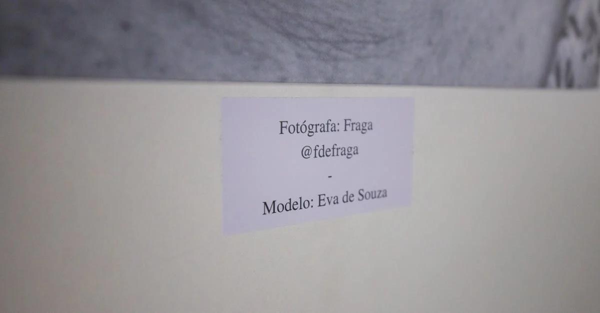
Whenever I walk into an art exhibition my eyes are always drawn to the labels beside each piece. These small details do more than just identify an artwork—they tell a story guide the viewer and shape the entire experience. Getting the label right can make a big difference in how people connect with my work.
I know that creating an effective label might seem simple but there’s actually an art to it. Whether I’m a seasoned artist or exhibiting for the first time I want my labels to be clear informative and inviting. Let’s explore what it takes to craft labels that do my artwork justice and leave a lasting impression on every visitor.
Importance of Labeling Artwork in an Exhibition

Labeling artwork in an exhibition delivers clarity for viewers, ensuring each piece receives proper attribution and context. Accurate labels guide audiences through galleries by offering essential information, such as artist name, artwork title, creation date, and medium. Displaying these details next to a piece sets a professional tone for the exhibition and helps establish trust in curatorial standards.
Labels also strengthen viewer engagement. Descriptive labels introduce interpretative insights, artist background, or relevant historical context. This narrative connection encourages deeper exploration, sparking curiosity and learning—qualities that increase visitor satisfaction and return rates.
Maintaining consistency and accuracy in labeling reinforces the exhibition’s credibility. Errors or omissions in artist statements, artwork dates, or exhibition credits disrupt the visual and educational flow, diminishing the value of the display.
| Label Element | Purpose | Example |
|---|---|---|
| Artist Name | Acknowledges creator | “Jean-Michel Basquiat” |
| Artwork Title | Provides unique identification | “Untitled (1982)” |
| Year | Communicates historical context | “1982” |
| Medium | Specifies materials used for clarity | “Acrylic and spray paint on canvas” |
| Dimensions | Gives scale and physical context | “72 x 68 inches” |
| Description | Offers background or interpretation | “Explores themes of identity and protest.” |
Essential Information to Include on an Artwork Label

Comprehensive artwork labels present concise details, building trust in exhibition quality and aiding visitor understanding. I focus on clarity and factual accuracy to ensure each label connects the artwork with its audience.
Artist Name
Artist names identify creators, establishing personal context. I display full legal names, for example, “Carolyn Parker” or “Diego Rivera,” with spelling matching official records.
Title of the Artwork
Artworks typically include an official title, such as “Sunset Over Paris” or “Untitled.” I format these in italics or quotation marks for emphasis.
Year of Creation
Creation years show an artwork’s historical context, using a single year or year range, such as “2020” or “1999–2003.” I confirm accuracy with the artist or records.
Medium and Materials
Mediums and materials describe what an artist used, clarifying the process. I specify examples like “Oil on canvas,” “Mixed media sculpture,” or “Ink on paper” for transparency.
Dimensions
Dimensions quantify artwork size, using height × width × depth and standard units. I list centimeters or inches, for instance, “50 x 40 cm” or “20 x 16 in.”
Additional Details
Additional details enhance interpretation, including provenance, descriptive notes, or exhibition histories.
Example Artwork Label Table
| Artist Name | Artwork Title | Year | Medium | Dimensions | Additional Details |
|---|---|---|---|---|---|
| Maya Lee | “Vivid Sky” | 2019 | Acrylic on canvas | 36 x 24 in | Private collection |
| Hiro Tanaka | Untitled | 2022 | Ink on paper | 12 x 9 in | Shown at Art Expo 2023 |
| Isabella Jones | “River Memory” | 2021 | Watercolor, mixed media | 18 x 14 cm | Inspired by Thames trip |
Each element provides defined context, ensuring artwork labels meet curatorial standards and inform visitors accurately.
Best Practices for Designing Artwork Labels
Consistent artwork labels clarify information and support a seamless viewer experience. Well-designed labels ensure that each detail about the artist, artwork, and context remains accessible and easy to read throughout the exhibition.
Font Choice and Readability
Readable fonts maintain label clarity and accessibility. I select sans-serif fonts like Arial, Helvetica, or Calibri for labels, avoiding decorative typefaces. I keep font sizes between 14-18 pt for standard wall placement, increasing the size for lower or less accessible placements. Proper line spacing and left alignment improve scanability. I use high-contrast color pairs, such as black text on a white background, ensuring text stands out in varied lighting.
| Font Type | Font Size (pt) | Placement Context | Contrast Suggestion |
|---|---|---|---|
| Arial | 14-18 | Eye-level, well-lit | Black on white, white on gray |
| Helvetica | 14-18 | Dim spaces | White on dark charcoal |
| Calibri | 16-20 | Lower labels | Black on off-white |
Label Size and Placement
Label dimensions and positioning affect usability and professionalism. I choose label sizes based on viewing distance: 6 x 4 in (15 x 10 cm) for most gallery settings, using larger labels for extensive details or high-traffic areas. I place labels 48-60 in (122-152 cm) from the floor to the label’s center, keeping the artwork-label distance consistent, typically 6-12 in (15-30 cm) from the edge of the artwork. I orient all labels horizontally and avoid placement under strong glare.
| Label Size | Ideal Viewing Distance | Placement Height (from floor) | Artwork-Label Distance |
|---|---|---|---|
| 6 x 4 in (15 x 10 cm) | 2-6 ft (61-183 cm) | 48-60 in (122-152 cm) | 6-12 in (15-30 cm) |
| 8 x 6 in (20 x 15 cm) | 6-10 ft (183-305 cm) | 54 in (137 cm) | 10 in (25 cm) |
Consistency Across the Exhibition
Consistent formatting fosters trust and visual harmony. I use the same font, font size, and label outline for every work in the exhibition. I standardize information order: artist, title (in italics), year, medium, dimensions, provenance (if included). I match text alignment and spacing across all labels. I preview the exhibition under actual lighting, ensuring labels retain clarity and visual consistency for every visitor journey.
| Consistency Feature | Standardization Example |
|---|---|
| Font type & size | Arial 16 pt on all labels |
| Label background | White matte throughout |
| Content order | Artist, Title, Year, Medium |
| Alignment | Left-aligned, single-line gap |
| Hanging height | 54 in (137 cm) for all labels |
Common Mistakes to Avoid When Labeling Artwork

Omitting Essential Information
Leaving out details like the artist’s name, artwork title, creation year, medium, or dimensions leads to confusion and appears unprofessional. For example, a label missing the medium can prevent viewers from fully understanding the artist’s process.
Using Inconsistent Formatting
Combining multiple font styles, colors, or alignments throughout the exhibition disrupts visual harmony and weakens the exhibition’s trustworthiness. For instance, some labels in serif and others in sans-serif create inconsistency that distracts visitors.
Placing Labels Incorrectly
Positioning labels too high, low, or far from artworks frustrates visitors. Standard practice sets labels 48–60 inches from the floor and within 6–12 inches of the paired piece for optimal reading and association.
Overloading with Text
Long descriptions packed with unnecessary details or curatorial jargon overwhelm viewers. Brevity and clarity support engagement, like limiting wall labels to 50–100 words for interpretive context.
Using Poor Contrast or Small Fonts
Low-contrast color schemes and small text make labels hard to read. Using dark text on a white background or white on black, with a font size of 14–18 pt, maintains accessibility for most viewers.
Misspelling or Fact Errors
Incorrect artist names, dates, or artwork titles erode credibility. Double-checking label content against reliable sources such as artist CVs and institutional records prevents these issues.
Table: Common Labeling Mistakes
| Mistake | Example | Impact |
|---|---|---|
| Missing information | No date or medium listed | Visitor confusion |
| Formatting inconsistency | Mixed fonts and alignments | Distracts, seems unprofessional |
| Placement too distant | >12 inches from artwork | Hinders association |
| Excessive text | Blocks of >100 words | Reduces readability |
| Low contrast/small font | Light gray on white, 10 pt font | Accessibility issues |
| Factual errors | Incorrect artist’s name | Damages trust |
Tips for Digital and Interactive Labels

I focus on digital and interactive labels to expand engagement and accessibility in exhibitions. I select digital labels when aiming to reach visitors who use mobile devices or prefer accessing content in various languages.
Key Elements for Digital Art Labels
| Label Feature | Description | Example Usage |
|---|---|---|
| QR Codes | Quick scanning for label access | On wall beside artwork |
| NFC Tags | Tap-enabled information retrieval | Embedded in label plaque |
| Digital Screens | Rotating or dynamic text/images | Next to high-traffic art |
| Language Toggle | Multilingual label options | Touchscreen menus |
| Audio Narration | Accessible recorded explanations | Headphones or speakers |
I include elements like QR codes and NFC tags to allow instant content access for each artwork. I integrate multilingual support in digital labels when the exhibition attracts an international audience. I add audio options to digital labels to enhance accessibility for visitors with visual impairments.
Best Practices for Interactive Label Formats
- Display multimedia, such as images, artist interviews, or close-up art details, for deeper context.
- Allow visitors to submit questions or feedback through digital kiosks or via online forms, fostering interaction.
- Maintain readability by using clear fonts, high contrast colors, and consistent iconography across all digital label devices.
- Update label content remotely as artworks rotate or details change, ensuring accuracy.
Digital Label Placement and Accessibility
| Placement Guideline | Digital Example | Accessibility Enhancement |
|---|---|---|
| Eye-level Mounting | Tablet on pedestal/screen | Wheelchair-accessible positioning |
| Lighting Consideration | Anti-glare screen protection | Consistent visibility |
| Proximity to Artwork | Directly adjacent | Easy navigation and reference |
I ensure every digital label remains visible and unobtrusive. I position screens at heights between 48-60 inches from the floor to accommodate all visitors, following ADA recommendations (source: ADA.gov).
Data Privacy and Security for Digital Labels
- Collect minimal visitor information if interactive features request feedback or usage data.
- Use secure networks and encryption for any data transmission in digital label systems.
- Disclose any data collection policies in a clear digital notice accessible from every interactive station.
I keep digital labels up to date, visually accessible, and interactive only where privacy and security standards meet institutional best practices.
Conclusion
When I label artwork for an exhibition I see it as an opportunity to connect with viewers and elevate their experience. Thoughtful labels act as bridges between the art and its audience inviting curiosity and deeper engagement.
By focusing on clarity consistency and accessibility I make sure each label supports the story I want my exhibition to tell. Whether using traditional or digital formats my goal is always to help visitors feel informed welcome and inspired as they explore the gallery.
Frequently Asked Questions
What is the purpose of labels in art exhibitions?
Labels in art exhibitions identify artworks and provide visitors with key information such as the artist, title, date, and medium. They also enhance the viewer’s experience by telling a story, offering context, and encouraging deeper engagement.
What essential information should be included on an artwork label?
An artwork label should include the artist’s full name, the artwork’s title, the year it was created, the medium or materials used, and the piece’s dimensions. Additional details like provenance or exhibition history can also be useful.
How can effective labels enhance the visitor experience?
Effective labels make exhibitions more accessible and engaging by giving viewers clear, concise information and interpretative insights. This helps visitors understand the art better, making their experience more meaningful.
What are the best practices for designing artwork labels?
Use easy-to-read sans-serif fonts (like Arial or Helvetica) in sizes 14-18 pt, with high-contrast colors for visibility. Maintain consistent formatting, organize content clearly, and place labels at a uniform height and readable distance from each artwork.
What common mistakes should be avoided in art labeling?
Avoid omitting key information, inconsistent formatting, poor contrast or tiny fonts, placing labels incorrectly, and overloading with text. Double-check for factual errors and make sure content is accurate and up to date.
How can digital and interactive labels benefit art exhibitions?
Digital and interactive labels can expand visitor engagement through multimedia, language options, audio narration, and accessibility features. Tools like QR codes or digital screens make it easier for visitors to access extra information and interact with the exhibit.
How should digital art labels be placed for maximum accessibility?
Digital labels should be easily visible, placed near the artwork but not intrusive, and comply with ADA standards for screen height and font size to ensure all visitors can access them comfortably.
What privacy considerations exist for digital art labels?
Collect the minimal amount of visitor data needed and ensure all data transmission is secure. Always inform visitors if their data is being collected and follow relevant privacy regulations to protect their information.
